Website Redesign
Categories
- Experience Update
- UI Design
- Visual System
Ledger Redesign
©2024
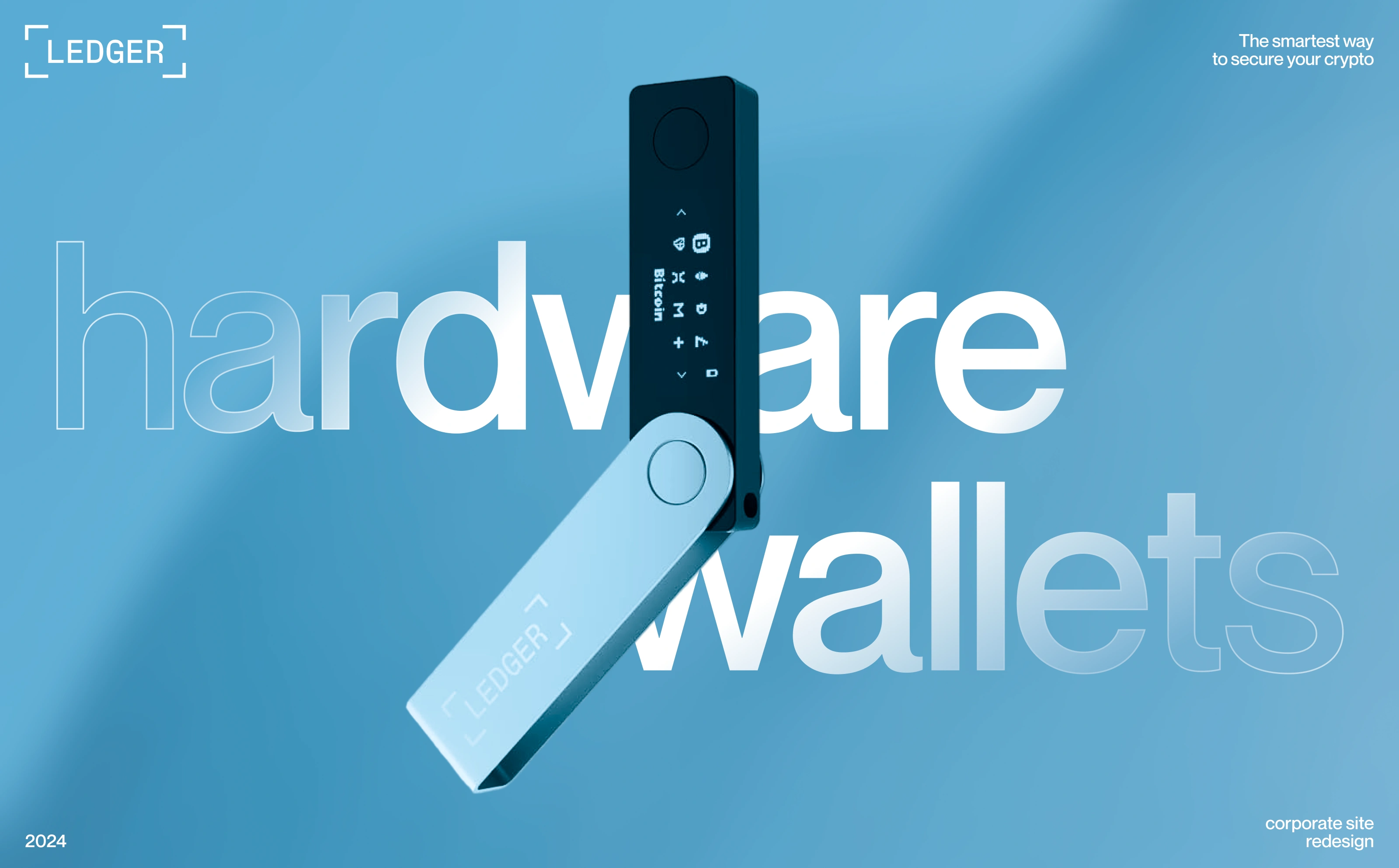
Your keys your control
Problem
The original Ledger website presented a strong product but lacked clarity and focus in the user journey. Key information about security, product differences, and use cases was scattered across the pages, making it harder for users to quickly understand the value of the product. The experience felt overloaded, with too many competing elements and no clear hierarchy guiding users toward a decision.
The redesign focused on simplifying the structure and creating a more intuitive flow. Information was reorganized into clear sections, emphasizing security, product benefits, and key features in a more digestible way. Improved visual hierarchy and cleaner layouts helped users navigate faster, understand the product instantly, and move confidently toward purchase. This resulted in a smoother, more focused experience that better communicates trust and value.
The redesign focused on simplifying the structure and creating a more intuitive flow. Information was reorganized into clear sections, emphasizing security, product benefits, and key features in a more digestible way. Improved visual hierarchy and cleaner layouts helped users navigate faster, understand the product instantly, and move confidently toward purchase. This resulted in a smoother, more focused experience that better communicates trust and value.
My Role
-
Website redesign conceptAudit
-
UX improvement strategyPriorities
-
User flow optimizationNavigation
Process
-
Market & competitor researchPatterns
-
Usability gap analysisIssues
-
Structural redesignLayout